Optimizing images in emails for your intended audience: so seemingly-straightforward, but oftentimes elusive. What gives? How do you get noticed among a sea of unreads in an anyone’s inbox?
Here are some super-effective ways to get your audience to straighten up in their seats and pay attention to what your brand is saying.
1. If at first you don’t succeed… test, test, and try testing again
The only true way to ensure your emails are appearing as intended is to test emails across browsers and on mobile and tablet devices, says Jerry Jao, CEO of Retention Science and email marketing expert. Make sure to test across all platforms, such as your buddy’s Samsung Galaxy along with your own iPhone 5c, for instance.
Marketing pros should also test against different ISPs and service providers because many treat in-email images differently. Ask around! You’d be surprised how many colleagues use a network you haven’t tried testing on.
2. Know who you’re talking to
Jao also says it’s crucial to consider your demographic when testing and optimizing images for send. The best marketers, he argues, segment email campaigns so that certain images are sent to one group and different images to another.
Here’s a quick tip: got an audience that skews both younger and older? Include more conservative or mature-looking graphics intended toward those age 35+, and vibrant, progressive images in campaigns to a younger audience. Remember to A/B test for best results.
3. Call it like it is
Insert a caption under an image (where appropriate) that briefly describes it. Most ISPs automatically block images, says Jao, so it’s important to include alternative text to give the viewer a sense of what they’re seeing – or not seeing.
In fact, a general rule of thumb for email marketers is that one in five recipients will be unable to view an image without taking extra steps (such as clicking “view image”). This can also act as an incentive to help them click through to turn on email images they’d rather not miss out on.
4. Go back to basics
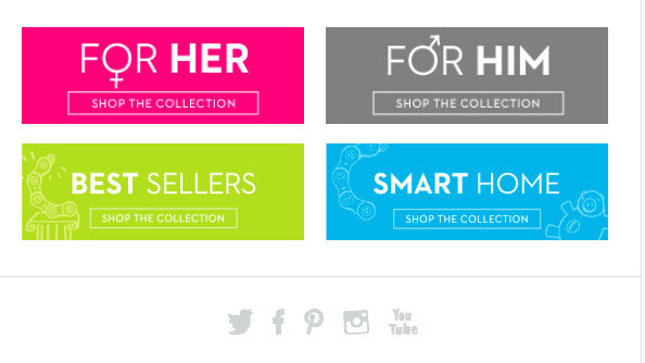
Matt Caldwell, Vice President of Creative at email marketing firm Yesmail recommends that words should always be in HTML – using words as an image may restrict the visibility of your messaging.
We understand you want to use nice fonts that fit with your brand’s aesthetic. Thanks in part to our society-fueled gadget dependencies, the advent of Google fonts means that marketers and brands are no longer restricted to Arial. While it’s not a guarantee that your font of choice will display every time, the operating system will automatically revert to Arial if need be.
5. Be proactive, not reactive
Be a brand that responds to your consumer in intuitive ways. It almost goes without saying, now, that a brand’s email layouts should respond to the platform they’re displayed on, whether that’s on desktop, mobile or a tablet browser.
When working with Web developers, request that any set of code (HTML, CSS, Javascript, Ruby on Rails) be implemented with a responsive design component in place for this reason.
6. Know how to prioritize what matters – in some cases, that’s mobile
You can improve email formatting and not risk your user’s email experience. Caldwell recently worked with a shoe retailer who sent e-coupons. A majority of customers signed up for the promotion in-store and viewed the resulting email on a mobile device.
While the desktop email version contained an image of teenagers (the brand’s target market) using the product, Caldwell’s team chose to hide that image on mobile, placing the most value on getting a user to redeem the coupon.
“We sacrificed a photo that displayed the brand’s personality, but greatly enhanced the user experience,” said Caldwell.
7. How much time does it take to load an email on mobile? It may be costing you.
Several factors play into an image’s load time on-email, including whether the device is set to use Wi-Fi, 3G or 4G.
“From our tests done with a high-end retailer, we’ve learned that when you use smaller images in a responsive design version of an email, you can cut a user’s load time by as much as six seconds,” says Wacarra Yeomans, Director of Creative Services at Responsys.
Bottom line? Optimize design for a higher load time – and ultimately a higher potential conversion rate for your email.
Get the TNW newsletter
Get the most important tech news in your inbox each week.


