Although I’ve moved away from using Evernote as my daily writing app, it’s still the best tool I know of to store and organize important information, so it’s easily searchable and accessible.
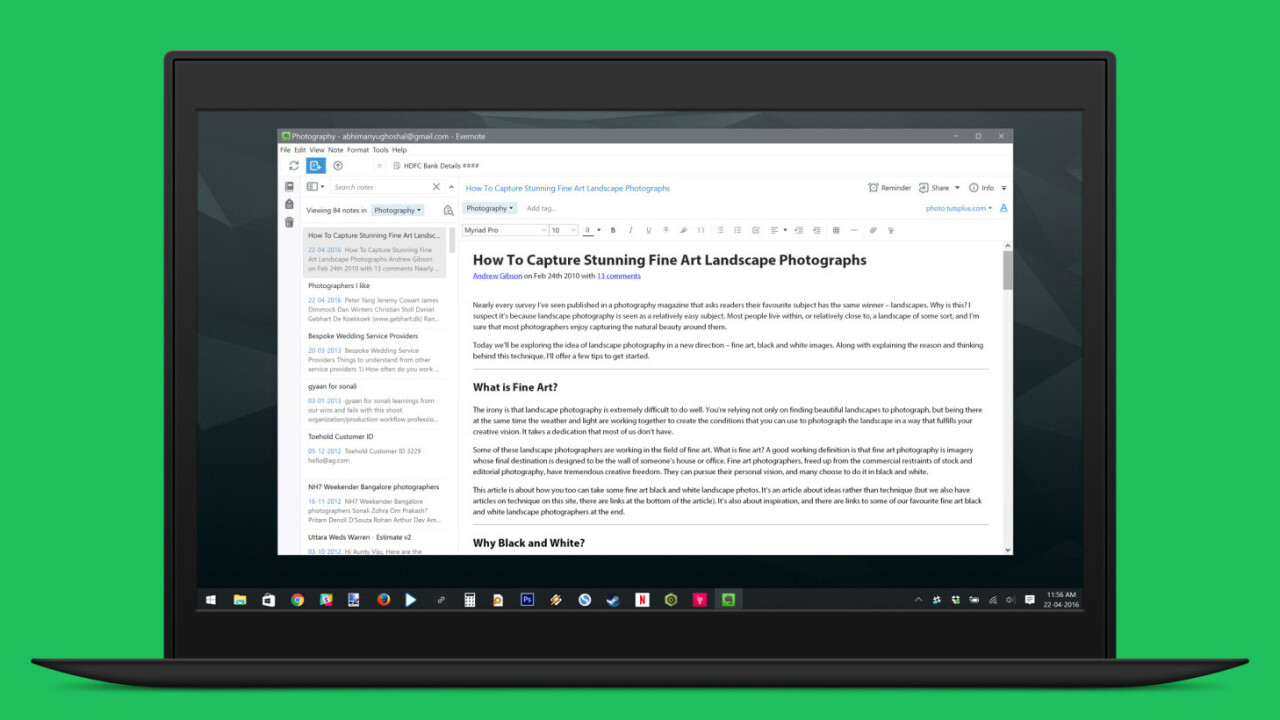
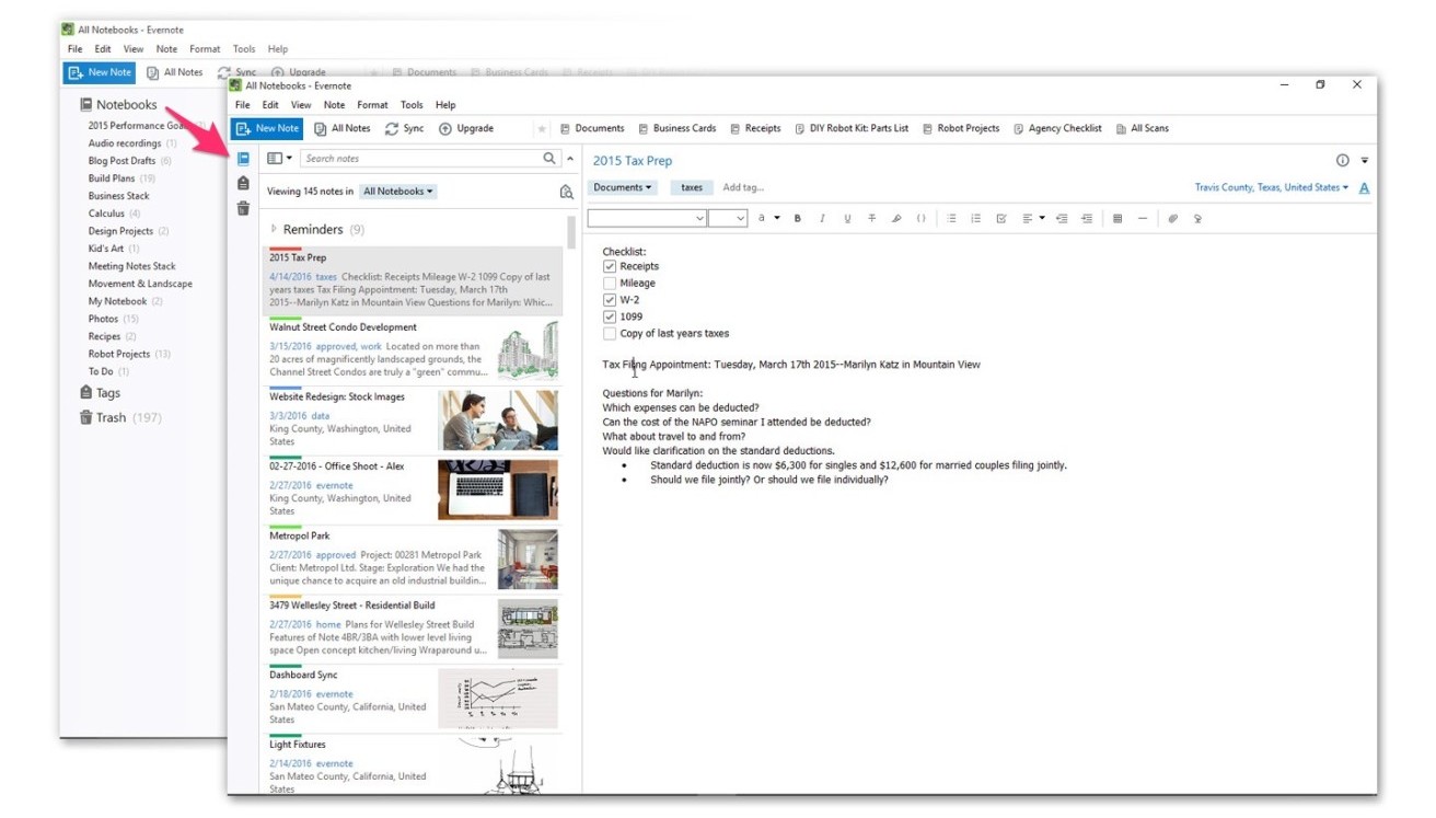
Today, Evernote’s Windows app has got a major overhaul with a beautiful new interface and improved functionality that makes me want to use it more often.
For starters, the app looks a lot cleaner and less cluttered, thanks to redesigned sidebar that blends in with the note preview panel. If you need more room to see and edit your notes, you can minimize the sidebar so it only takes up an icon’s width on your screen.

If you use Evernote Business, you’ll now be able to filter your notebooks, tags and shortcuts by ‘personal’ and ‘business’ – simply switch between the two tabs near the top of the screen, or, hit Alt+1 or Alt+2 on your keyboard.
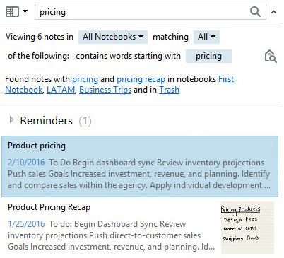
Search has also improved in version 6. When you look up a phrase, the app suggest narrowing down to specific notebooks and refining or broadening your search by using parameters like matching any or all of the words you’ve entered. It’ll also automatically search through your trashed notes.

The new version is now available to download from Evernote’s site; if you already have the app installed, click on Help > Check for updates to get it.
Get the TNW newsletter
Get the most important tech news in your inbox each week.


