Renowned designer Yves Béhar made an appearance at the 2014 LAUNCH Festival today to chat with Jason Calacanis about the state of design and offered words of wisdom to those creating hardware, along with a critique of some of the industry’s latest innovations.
If you’re not familiar with Béhar, he’s helped design products for Herman Miller, PUMA, Mini, Samsung, General Electric, and also One Laptop Per Child. Although a designer since he was 16, Béhar didn’t really get into the consumer space until he moved to California from Switzerland, but realized soon after that many products weren’t really being thought out from a user’s standpoint and needed to be done better.
However, the perception about design has changed during Béhar’s career, specifically in the US. When thinking about design, people often considered Paris, Milan, and other locations as the hub of creativity. Today, the attitude has shifted, with Silicon Valley now being viewed as a center of design. What’s more, the understanding of the profession has also shifted as design is no longer thought of as something you bring in at the end of the development process — now it’s become a critical part throughout the lifecycle.
So what words of wisdom did Béhar offer his fellow designers? It should be about how you treat your customers — this is a fundamental principle to help motivate users to adopt the functionality of the app, hardware, or service in their daily lives.
If you treat them from an ergonomic, user, and emotional standpoint throughout the different experiences of your idea and company, you’re probably practicing good design.
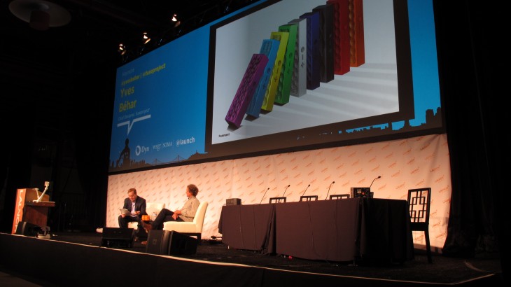
Calacanis asked Béhar about his experience at JAMBOX and how the design of the portable speaker box was conceived. Béhar explained that in the creation stage, he believed that music was something that people experience in a selfish manner. It was about encouraging consumers to bring music to places where it’s not normally listened to. That being said, Béhar chose materials that would make the JAMBOX easy to transport either in a pocket or in the palm of someone’s hand.
In an age where the world has become fixated on wearable devices, whether it’s Google Glass, Pebble smartwatch, Jawbone UP, or anything else, Béhar thinks that design is challenging, but rewarding. The technology should be discrete on the body and less about cramming all the data on a smartphone onto the device. When asked about the Samsung Galaxy Gear smartwatch, Béhar says, “I don’t think we need a full interface on our wrist.” People will have their own needs for wearable devices, but he doesn’t believe that replicating the smartphone on a wrist-bound device is what’s needed.
With the Jawbone UP, the activity tracker that competes with the Nike+ Fuel band and the Fitbit, Béhar says that it was designed in order to be wearable on your wrist all day, but also that it was secure and adjusts to any wrist without impeding the hand’s movement. The appearance of the device was dictated by the user experience and design, not by the technology.
And of course, what about Google Glass? Béhar thinks it’s an interesting technology product, but he doesn’t believe it’ll be something that we use on a daily basis: “It’s interesting for specialized applications, but needs to be designed in a way that will be unobtrusive for the masses.” He relates it to the Segway, saying that it didn’t help with the natural interactions humans are accustomed to.
Today, as entrepreneurs and companies are eager to ship their products to solicit feedback and iterate as much as possible, what advice would Béhar give founders? Ship when it’s absolutely ready for primetime:
Keep perfecting it because you only have one chance. There’s no beta on hardware. You only have a single chance to wow people in order to convince them to keep it and you should put everything in your corner to get to that point.
Boiled down, Béhar says that designers should keep things simple. He equates it to a light switch, where you only have to flip it to turn on power. If your experience is more complicated than pushing a button, then it’s not going get wide adoption.
Photo credit: TED
Get the TNW newsletter
Get the most important tech news in your inbox each week.
