Windows 11 does a lot of things right, including a sleek new design that significantly tidies up the OS’ aesthetic. I think most people should upgrade, and that the pros outweigh the cons.
But it’s still a shame that the Start menu is kind of a mess.
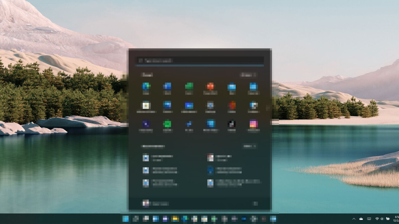
Although I appreciate the cleaner design and more minimalist UI, I can’t help but feel Windows 11’s Start menu ends up being overcomplicated by the quest for simplicity. Actions that were intuitive in the old Start menu, even if the UI was a little more cluttered, now take more steps or are not immediately clear to users. Worse, there’s almost no room for customization, and several basic features are tucked away in disparate UI elements.
Having lived with Windows 11 since the first builds showed up in June, I’ve taken note of a few places I feel Microsoft could make improvements. Admittedly, I’m not a designer, and it goes without saying this is just one person’s opinion, but I do think some of the following suggestions would address many users’ complaints,
Let me resize the Start menu
Part of the reason some people prefer Windows to macOS is that it is ostensibly a more customizable OS, but Windows 11 is a step back in this regard. Case in point: you can no longer resize the Start Menu.
It makes no sense that the Start menu is a fixed size. It is the same on a 32-inch monitor as it is on a 13-inch laptop screen. Besides, users have different needs and preferences. Some people prefer a minimal launcher with just a few visible icons, while others would rather be able to see all their apps at once.
The simple solution: let us resize the menu. Microsoft has made a small concession in the latest Windows Insider build, allowing testers to change how many pinned apps are shown at once, but the overall size of the menu remains the same.
Let me pin Widgets to the Start menu (or desktop)
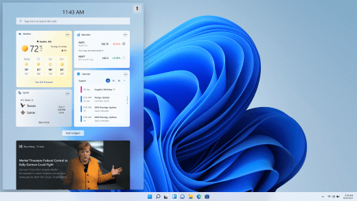
Windows 10’s Live Tiles were a cool idea that never really reached their potential. Windows 11’s Widgets are theoretically an improvement, allowing for larger content and giving developers more flexibility. The problem is, you could go your whole life using Windows 11 and never even notice Widgets are there.
Everyone uses the Start Menu, but Widgets are tucked away in their own separate menu. They get also their own shortcut (Win+W) and button in the taskbar. Because they’re not integrated into my existing workflow, I often forget Widgets are even a thing in Windows 11.
Compare that to, say, widgets on iOS or Android — or even Windows 10’s Live Tiles. Those are visible virtually every time you try to launch an app. That allows you to have information ready at a glance while simply going about your day, rather than forcing users to make a concerted effort to check their widgets.
On my Android phone, for example, the simple act of visiting my home screen to launch a new app means I get a reminder of the weather, the date, my calories burned, and my to-do list. There have been several occasions where I’ve been reminded of a task while in the process of opening an app — at least as often as I am by actually opening my to-do list.
I’m not saying the Widgets panel should go away, mind you. I actually really like the idea of having a place where you can view all your widgets at once. But for high-priority and regularly accessed widgets, I can’t help but feel they’d be a lot more useful if they were directly integrated into the Start menu or desktop — UI elements people already use multiple times a day.
As it stands, forcing Widgets to exist exclusively in a separate realm makes Windows 11 feel disjointed.
Combine (or rearrange) the Start and Search menus
Speaking of disjointed, one of my biggest pet peeves with Windows is the unnecessary split functionality between the Start and Search menus. Granted, this was a problem on Windows 10 too, but in Windows 11, it feels worse.
Windows 11’s Start menu has a ‘recommended’ section that, in theory, would show apps and files you actually want to open. Instead, it doesn’t seem to surface any apps at all, only files that I’m not actually interested in opening.
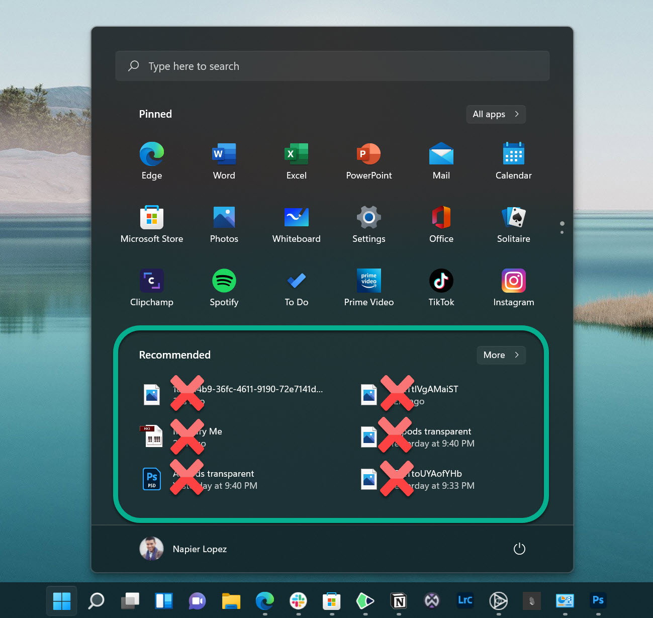
I’ve been on Windows 11 since the very first Insider build in June, and I’m pretty sure I haven’t clicked on a recommended item even once. That might be in part because I tend to prefer opening files from their respective apps rather than directly from Windows, but anecdotally, it seems to be wasted space for a lot of users.
Do you know what would be useful recommendations? My recently used apps. If I’ve opened an app before, chances are I’m going to open it again.
Yet for some reason, recently used apps are tucked away under the Search menu, as well as your most frequent apps. This all seems backward to me.
I don’t know about you, but the way I’ve always used Windows, the Start menu is first and foremost for opening apps. Therefore, things that have to do with opening apps should be in the Start menu. Meanwhile, it makes much more sense to me that recommended files be tucked under the Search menu. When I’ve used the Search function in Windows, it’s often been to look up a specific file, so it seems like recommended files should be in this menu instead.
But I also see no point for these menus to be separate in the first place. I realize Microsoft is trying to avoid clutter, but it shouldn’t do so at the expense of simplicity. Even though I can initiate a search from the Start menu, I think it’s a bit jarring that when you start typing, you are redirected to the Search menu.
Combined with the aforementioned Widgets being tucked away under yet another UI element, it means you have three different taskbar buttons for some of Windows 11’s most basic functionality.
Let me see all my apps in one click
Another small step back from Windows 11: viewing all your apps requires an extra click.
On Windows 10, I could simply press the Start button and instantly have access to my full list of apps. On Windows 11 you instead have a few pinned apps, and have to press a second ‘all apps’ button to see the full list. This gets a little annoying if you need to open several apps in quick succession that may not already be pinned.
One extra click may seem like a minuscule change, but it just feels like an unnecessary extra step.
It also assumes that the user will go through the trouble of pinning apps to the Start menu in the first place. Personally, I wouldn’t mind having the option to get rid of pinned apps in the Start menu altogether. Your most important apps are probably already pinned to the taskbar or desktop anyway, so having yet another place to bookmark apps seems like overkill if it’s going to make the older functionality worse. Heck, I’d much rather have the entire space dedicated to the Start menu simply be a list of all my apps.
Give users more options
I wouldn’t mind most of Windows 11’s Start menu changes if users had more ways to customize it, but so far, you’re locked into Microsoft’s initial vision.
That goes against what many users expect from Windows, and it highlights a common complaint about the new OS: it feels unfinished. Aside from the grievances listed above, you also can’t drag and drop files onto taskbar apps, one of the most basic and useful abilities in the Taskbar (although Microsoft says a fix is on the way), and you can’t move the taskbar to the top or sides of your screen either.
I think few people would say Windows 11 isn’t a big visual improvement over Windows 10, but at the end of the day, people use their PCs to get work done. The Start menu is one of the most important parts of Windows and functionality PC users have come to expect for years shouldn’t play second fiddle to aesthetics.
Get the TNW newsletter
Get the most important tech news in your inbox each week.
