The article that introduced responsive web design to the world was published by Ethan Marcotte just over five years ago.
In the short timespan since, responsive web design has gone from an interesting new idea to the industry-wide accepted approach to multi-device design. As we look to 2016, we can see that the maturation of this approach brings with it a number of best practices as well as some exciting trends.
Let’s take a look back at successful trends of the year with an eye towards the future.
1. Captivating storytelling
Mankind has always used stories to convey ideas and share information. Stories activate parts of your brain that simple facts and figures do not. On websites, storytelling creates more engaging and memorable website content.
This storytelling approach has been embraced by sites like Medium and by many web writers who are now using stories to better convey important details, information, and compelling data.
When using storytelling in your responsive website, some basic tips to follow include:
- Hook readers quickly and make sure that you have a strong opening that falls above the fold on all viewports so that readers see it immediately
- Ensure line lengths for your story are optimal for both large and small screens. Lines that are too long are hard to follow, while line that are too short break the flow of normal reading. Strive for a range between six to 75 characters per line and adjust font sizes as needed to achieve the best results.
- Use visuals where appropriate to accentuate the story, but be mindful of file sizes and ensure quick downloads on all devices
- Make it easy for readers to share the story with others. Consider placing sharing functionality at both the top and bottom of the content so that readers do not need to scroll to do use these features. This is especially helpful on small screen layouts that require substantial scrolling. Also make sure that these buttons can be easily used on touch screens.
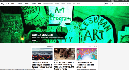
These points can be seen in practice in what Vice does with their homepage layout.
Mobile viewport

Full-size viewport
2. Less is more
Many SEO and website experts have long suggested that “bigger is better.”
Their argument is that a site with lots of pages has the best chance to rank for a wide variety of key terms. The problem with creating incredibly dense websites is that they can be confusing for people to use and they can be difficult to keep updated. Outdated pages and content are often left neglected, creating sites that are bloated and no longer relevant.
When you think about loading the content on smaller devices, you can imagine the usability nightmare that ensues.
Many websites have begun to take the opposite approach to this “bigger is better” recommendation. Smaller sites are hyper-focused on specific topics, eliminating any pages or content that aren’t critical to the user experience.
This “less is more” trend can be seen in the popularity of single-page websites, including parallax sites. You can also see it in sites that have aggressively simplified their sitemaps.
3. Patterns everywhere
When an approach becomes popular and widely used, like responsive web design has, patterns will often begin to emerge.
As explained in Web Design Trends 2015 & 2016 by UXPin:
A web design pattern, aka UI design pattern, is a reusable solution to a commonly occurring problem you might encounter every day.
The value in using a good web design pattern to solve a problem is that users will be familiar and comfortable with your solution. The downside to using established patterns is that if everyone uses the same approach, websites begin to look very much the same and design uniqueness is lost. You must weigh the benefit of using an established pattern against the downside of not being able to design something new and unique.
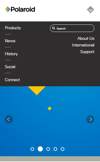
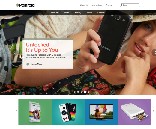
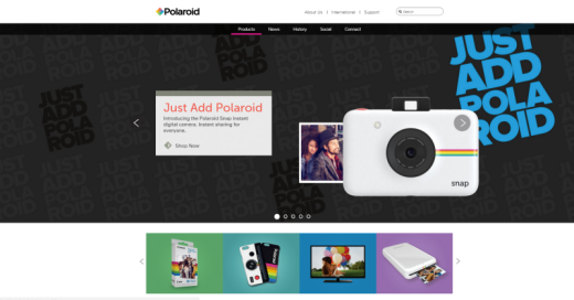
One common responsive pattern, for example, is off-canvas navigation.
Smallest viewport
In the smartphone view, a handy top-down toggle menu houses all the options:
Mid-sized viewport
The tablet view expands the navigation horizontally and adds a primary CTA in the middle of the screen along with four secondary CTAs at the bottom of the screen.
Largest viewport
The navigation and content layout remain the same as the tablet-sized viewport.
When evaluating design patterns, always ask yourself these questions:
- What problem am I trying to solve?
- How have others solved this same problem?
- Is there pattern to those solutions or an established best practice?
- Is this pattern overused?
- What barriers, if any, exist to using this pattern on my project?
To learn more about responsive web design patterns, check out some common layout patterns as outlined by Google and a useful responsive library by Brad Frost.
4. Card layouts
One of the most popular design trends today is the “card layout.” Popularized by Pinterest, the card layout has become a widely used approach to presenting easily scannable chunks of content on a website.
Card layouts are very attractive when considering the UX for responsive websites. Because these cards effectively break content down into smaller blocks, those blocks can then be more easily rearranged for different screen sizes and layout needs.
Smallest viewport

Largest viewport
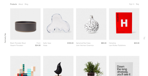
Cards can help improve information distribution, which is why sites like Twitter and Google have followed Pinterest’s lead with this UI pattern and why more and more sites are sure to apply this approach for 2016 and beyond.
5. Hidden menus
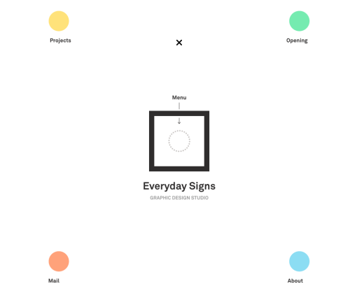
Another UI pattern example that has been popular for many years is the hidden menu. From drop-down and fly-out menus that are revealed on hover to the infamous “hamburger icon” to navigation drawers, hidden menus are used to save space while still making those menu option available to a site’s visitors.
While the benefit of saving space on a responsive design is undeniable, there have been a number of people who have argued against the practice of hidden menus. Menus that are hidden to save space are less likely to be accessed than those that are consistently shown.
Smallest viewport
Largest viewport
One experiment actually showed that these hidden navigation items cut engagement time in half.
The challenges of responsive navigation are something that UI designers continue to grapple with. Despite the possible downside to hidden menus, expect this design pattern to remain a popular choice for responsive navigation.
6. Big hero images versus no hero images
The hero image trend is quite interesting.
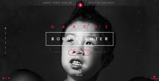
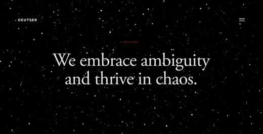
Many sites use gigantic hero images that span the entire width and height of a screen. Other sites have taken the exact opposite approach to hero images, eschewing their use altogether and preferring only bold colors and rich typography in their place.
Hero images
No hero images
These two competing trends each offer their own benefits and drawbacks. Using rich images can add visual flair to a design, but giant images mean additional time for those images and the site to load. Removing large hero images may decrease the visual richness of a design, but the loss of those images speeds up load time.
Additionally, according to Google/YouTube user experience research, removing these images can actually help create a more appealing site. In their study, researchers found that reducing the visual complexity of a page, while also increasing its prototypically, could actually increase its appeal.
In summary:
Big hero images
- Visually rich and appealing
- Slower loading times
No hero images
- Not as visually rich
- Faster loading time
- Less complexity can increase overall appeal
Both of these approaches to hero images are valid and each will likely remain popular in 2016.
7. Rethinking advertising
Online ads and responsive websites have always experienced a challenging relationship.
For years, online ads were sold based on size and locations. This poses a problem with responsive sites since the size and placement of various UI elements will change across different screen sizes. This makes fixed advertising sizes a poor fit in a responsive environment.
Changes in privacy concerns and how web browsers handle advertising are also sending shockwaves through this long-time staple of the Web.
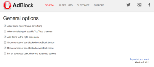
Apple’s iOS9 added substantial fuel to this fire with their announcement that they will now allow third party developers to create ad blocking software for the Mobile Safari browser. This change has the potential to fundamentally change the way the Web works.
In the very near future, all sites – responsive or not, will need to rethink how advertising is used.
8. Improved workflow
Not all trends can be seen visually on the final website. Some trends happen behind the scenes as that site is being designed and developed. An improved responsive workflow is one of those trends.
One important change many designers are using is responsive prototyping.
Instead of static design comps that seek to show different possible breakpoints in a potential design, responsive prototyping tools (like UXPin) create more authentic experiences that can be deploy quickly and easily.
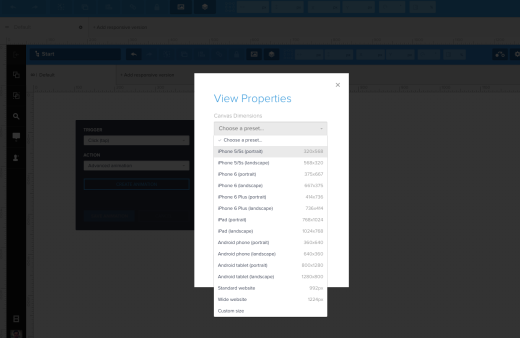
These prototypes will better convey interactions that will allow you to get more informed feedback and to make better overall UI design decisions.
Next steps
To learn more about best practices for web design, check out the free guide Web Design Trends 2015 and 2016. By analyzing 166 of today’s best web design examples, the guide deconstructs useful trends into simple design tactics.
Get the TNW newsletter
Get the most important tech news in your inbox each week.


