Save over 40% when you secure your tickets today to TNW Conference 💥 Prices will increase on November 22 →

This article was published on July 1, 2021

How to organize your horribly chaotic Slack sidebar

It's time to get your life together


How to organize your horribly chaotic Slack sidebar

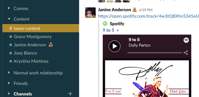
Do you ever wonder why your coworker’s Slack sidebar looks so much better than yours? It’s probably because they organized it. You can tweak all sorts of settings in Slack, from how the sidebar behaves to how it looks.

Let’s outline these tweaks one at a time.

Only see unread channels in the Slack sidebar

By default, Slack shows every channel you join and the person you DM in the sidebar, which means it can get cluttered quickly. That’s why you should customize your Slack sidebar to only show what matters.

I recommend that you first set the Channels section to only show unread channels. Hover over Channels, click the three dots to the right, then click Unread channels only.
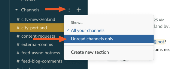
Slack unread channels only
You will now only see channels in the sidebar if there’s something unread. You can repeat this process for direct messages, if you like, and things will look really clean really quickly.

Create personalized sections in the Slack sidebar

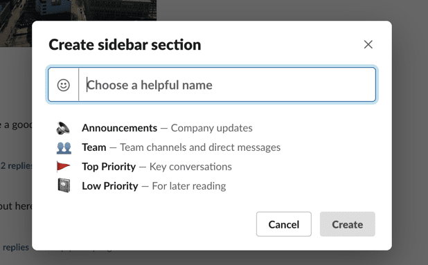
Of course, there probably are some channels you want to keep track of, so I recommend that you create sections for them. Click the three dots next to Channels again, then click Create new section.
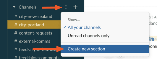
Slack create new section
You can now create a section for your sidebar, complete with an (optional) emoji.

slack choose sidebar section name
You can add as many sections as you like, then drag DMs and channels to the relevant sections. I opted for the clean look, free of emojis, that allows me to see different things in the sidebar depending on which team I’m working with right now.

slack sidebar example
My coworkers have customized this in all sorts of creative ways.

slack creative sidebar sections
Tweak this until it looks just right for your usage.

Change the order that channels are listed in

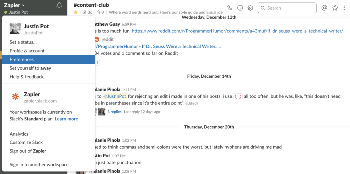
You can also tweak what order your Slack channels show up in. Click the name of your organization, at top-left, then click Preferences.
Slack preferences
Now head to the Sidebar section.

slack sort by priority
The default option, alphabetically, is probably best for most people. If you’re feeling brave, though, Slack can sort things “By priority,” which means the channels you use most often end up on top. You can also decide here whether private and shared channels show up in their own lists.

Once you’ve grouped your channels into sections, you can also drag and drop each channel into a new order, or even a new section.

Change the Slack sidebar color scheme

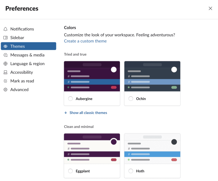
Now that you’ve organized your sidebar, it’s time to get to the fun stuff: customizing how Slack’s sidebar looks. Go to Preferences > Themes, scroll down, and you’ll see a few default themes to choose from:
Slack themes
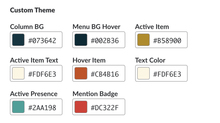
These are fine, but I’m sure you were hoping for more options. Good news! You can design literally whatever theme you want using the Custom Theme option.

SlackThemes.net
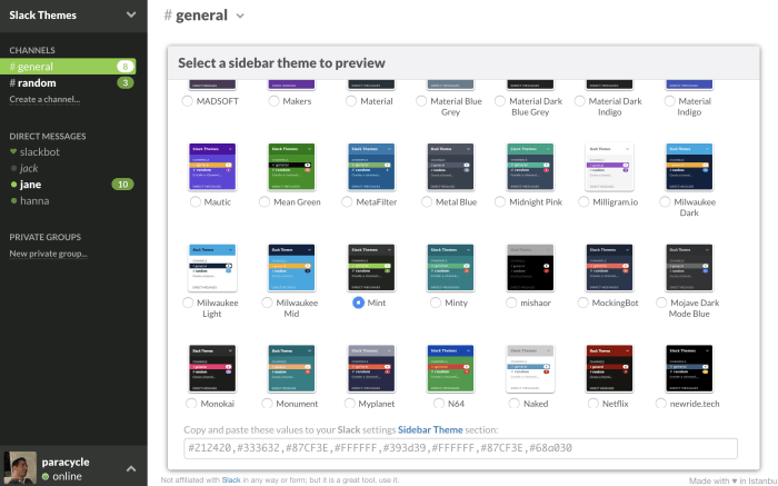
This is, of course, way too much work, which is why I’m thrilled to share even better news: you can quickly grab themes from SlackThemes.net. There’s a bunch of good ones here.

Just find a theme you like, copy the values, then paste them in back in Slack. You’ll have a great-looking Slack in no time.

This article by Justin Pot was originally published on the Zapier blog and is republished here with permission. You can read the original article here.

Get the TNW newsletter

Get the most important tech news in your inbox each week.

Also tagged with