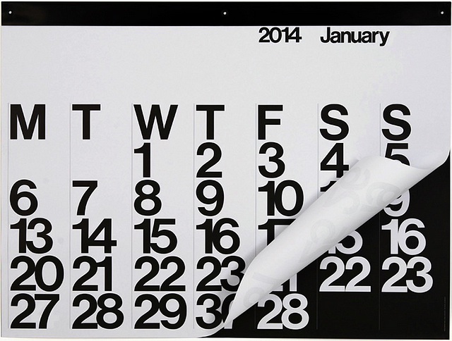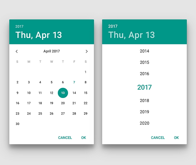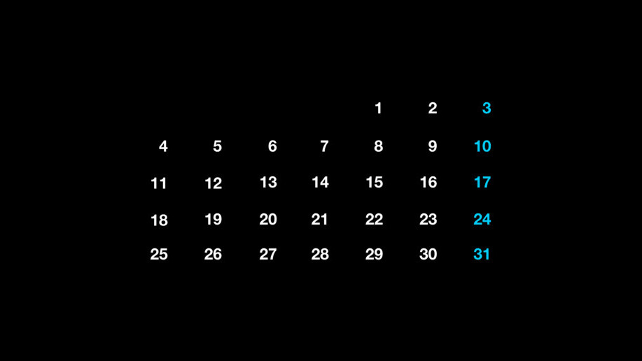
What is the first image you visualize in your head when you think about a calendar? Probably a table with numbers arranged in seven columns and five rows (or six row depending on day one) to display the full month ahead. We use it every day, whether on your phone or on your wall. Same design no matter the medium, the same format has moved from posters to digital apps without any alteration.
We are surrounded by objects that have history, sometimes that span centuries, and we completely ignore it. Anytime I encounter design patterns that are so well embedded in our lives I wonder what were the design decisions — who took them — that made that object to be what it is today. The calendar grid is one of them.
I have the presumption to say that when patterns lived the test of time they may have reached their maximum improvement point — which means that users are satisfied with the solution of a specific problem, and no further iterations are required to fulfill their needs. Nobody stops designers to keep iterating but most likely the features they will add — for example, legibility in case of a calendar — will be just laying in a plateau of incremental improvements (see Fig. 1).
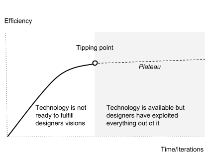
Usually, when a product reaches that zone is most likely it will be surpassed by new products, that solves the same problem, but using a different route, rendering obsolete the predecessors. But the calendar as we know it today has long-lived any other design and it seems nobody needs a new version of it. It probably reached its tipping point, like some common interfaces we use today like the calculator of the phone keypad.
So, who is the author of this great design? In this article, I may only shed some lights on this obscure path because there are only a handful of artifacts, still existing today, that would prove the origin of the calendar grid.
But before investigating the design, let’s take a quick overview of the concept behind the calendar.
A seven-day cycle seems to have a mixed and synchronous origin which are hard to trace and provide the ultimate inventor: it was practiced in Judaism since the 6th century BC and the number seven also had a mystical significance to Babylonians. It was associated with the seven heavenly bodies; the Sun, Moon, Mars, Mercury, Jupiter, Venus, and Saturn. A seven-day week based on these same celestial bodies was adopted as far away as Japan and ancient China. But the popularity of the seven-day week — and its prominence in modern calendars — can be traced to its adoption by the Romans: emperor Constantine formally adopted the seven-day week in AD 321. Which means we have been using this practice for about 1,700 years straight.
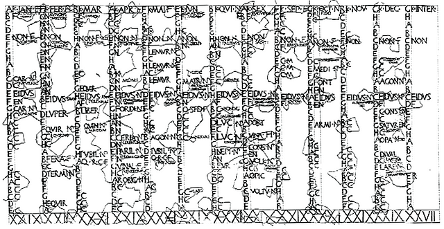
The Julian calendar, introduced by Julius Caesar in 46 BC. It’s impossible to find a unique inventor when is that far away from the present. So we have to speak in terms of the ability to make a convention popular. Romans again can be attributed to being the agent in making the month defined by 30/31 days.
Of course, they didn’t do the math correctly, as they were using only 8 months a year. But due to their presence in the western culture, this practice stood the Gregorian reform to this day.
If Romans gave us the calendar as we know it, we still don’t know who popularized the grid format. The grid itself seems like a natural choice because it’s the most intuitive and real-estate efficient way to display a sequence of elements — Egyptians were already using grids for their calendars. It almost seems it does not need an inventor at all like we’d never ask who invented writing.
The calendar seems to follow the same path, although the visual representation of months and weeks change direction between the 16th and 17th centuries.
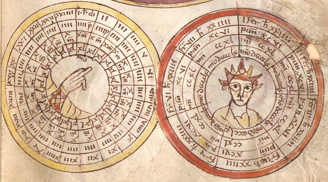
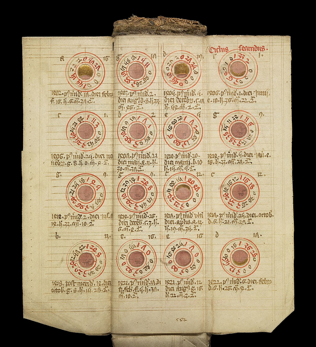
Before the 1600s it was popular to represent years, months and weeks using circular diagrams because it’s the best way to represent cycles. The calendars were conceived as perpetual devices and not as planners showing the year ahead, neither was present any correlation between day name and the date — the seven-day week as we know it.
For many decades to come the only design available were perpetual calendars, a tool valid for many years, designed to allow the calculation of the day of the week for a given date in the future — not as disposable and year-specific as is produced today. Disposable or advertising calendar will be available only when the industrial revolution will make printing very cheap and therefore available to the masses.
The modern calendar evolved alongside others such as almanacs, which collected religious, cultural, meteorological, astronomical and astrological information in a table format — also ephemeris was layout as grids. But the major shift in the calendar design, from circles to tables arrangements, will happen only in the late 15th century, not only because of the Gregorian calendar revision of 1582, but probably, because of the introduction of the printing press by Johannes Gutenberg.
I have no historical facts to back up my hypothesis, but I see a correlation between movable types and their natural congeniality to a grid system with the standardization of the table format.
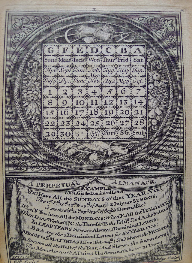
Any special design required printers to hire artists to produce a separate plate, usually woodcut, rather than using types, so it seems highly possible that the printing press helped perpetual calendars grid layouts to become a more practical standard, especially because types can be easily rearranged for any month of the year.
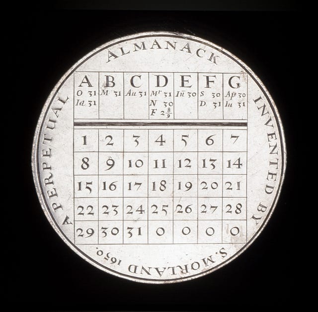
Samuel Morland’s perpetual almanac, dated 1650, it’s an interesting early example of these approaches. Interestingly there is no mention of the weekday names, but only the first seven letters of the alphabet, a format also seen in a later print from William Parsons pocketbook from the early 17th century.
Planner, diaries, and advertising contribution
In 1773, Robert Aitken, who was a publisher, invented what he claimed was America’s first daily planner, offering his customers a preset layout, not unlike the planners of today. For the first time ever, Americans could see their days laid out in a list, like modern agendas, and plan ahead their “to-do” going beyond the almanac’s generic predictions.
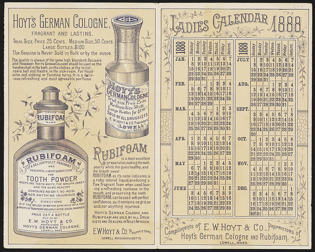
Alongside their practical use, calendars have developed into a decorative item. The late 18th century and across the second industrial revolution advertising calendars will become a popular vehicle to spread the brand identity in people households. Hotels, gas stations, banks, small or big brands all will be offering complimentary calendars as a mean to boost their presence.
We have to wait until the 1960s to return to a minimalism where the graphic design and the typeface become the object of experimentation, also facilitated by the introduction of Helvetica and modernist approach. Most famous and celebrated output of that era happen to come from two Italians in the same year: Vignelli famous large wall calendar, and Enzo Mari perpetual versions, both here to stay in our households.
The future of calendars
Did the calendar reach the maximum improvability? It may be so, and the latest digital version found on Android or iOS, prove the design is still strong and indisputable although the desire to try a new format is undoubtedly alluring.
Some designers have attempted to break the convention. Most famously John Maeda experimented with interfaces now adopted by the MoMA permanent collection and most recently Teehan+Lax, the Canadian agency (later absorbed by Facebook), played with a new paradigm you can see the prototype here.
Certainly is, nothing beat a simple grid and the calendar as we know it is here to stay, for many calendars to come.
Timeline
- 321: emperor Constantine adopts the seven-day week
- 900–1500: artifacts from this period show calendars were represented as circular diagrams
- 1500: Gutenberg press and broadside printing
- 1582: Gregorian calendar revision
- 1650: Samuel Morland Almanack — perpetual calendar
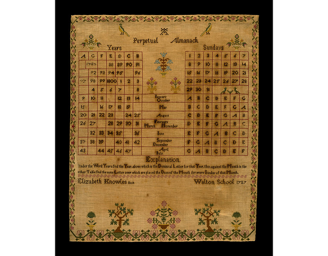
- 1650–1800: perpetual calendars as grid
- 1860: and later: early examples of the paper poster with grid calendars
- 1966: Massimo Vignelli, The Stendig Calendar
- 1966: Enzo Mari, Timor Perpetual Calendar
- 1995: John Maeda 2000 Year Calendar
Get the TNW newsletter
Get the most important tech news in your inbox each week.

