The News tabon Google’s search results pages is a pretty big deal when you’re trying to keep up with the world: for many people, it’s their quickest way to find news stories on topics they’re interested in. The search giant is now revamping this section on desktop – where it looks cluttered and hard to scan – to bring it in line with its mobile equivalent and improve readability.
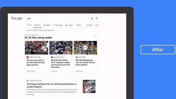
As per Google News Initiative’s tweet, each link will have its own card, allowing for more space. For instance, if you search for “women’s soccer world cup,” stories from major news organizations will show up in boxes, and other links will have their individual cards – as opposed to a jumble of links like you’re currently used to.
You can also click on each card to see the preview of the story. Hit the play button in the video embedded in the tweet for a closer look.
Over the next couple weeks we’re rolling out a redesigned News tab in Search on desktop. The refreshed design makes publisher names more prominent and organizes articles more clearly to help you find the news you need. Check it out ? pic.twitter.com/xa2aZfO4Qd
— Google News Initiative (@GoogleNewsInit) July 11, 2019
Publishers will also possibly benefit from the redesign, as it now prominently shows links and the name of the publication for each news story. Plus, the cards layout will show the full headline instead of displaying it until a certain character limit as shown in the screengrab below.
The update is planned to roll out over a few weeks, so it might be a while before you see the refreshed page design.
Get the TNW newsletter
Get the most important tech news in your inbox each week.


