Google may be releasing Android Nougat before launching its new Nexus devices, but that doesn’t mean it’s giving away all its goodies. A report by Android Police suggests Google is completely redesigning the Launcher app in time for its new devices.
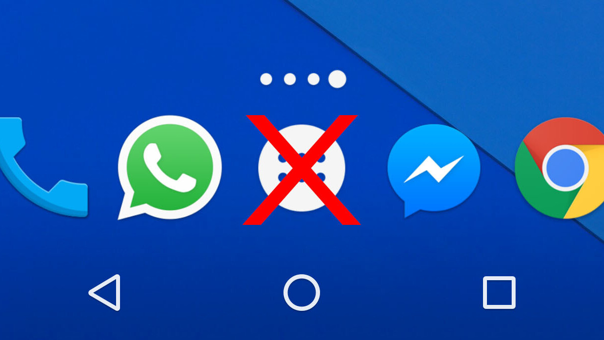
There are a few notable changes. First up, Google is killing the launcher icon with this design. Instead of tapping on said button to show your app list, you swipe up from the bottom.
The new gesture is noted by a small white arrow pointing upwards, and the quick-launch icons are surrounded by a frosted white color. The lack of a launcher icon also frees up the bottom row to hold five apps instead of four.
There’s also no search bar shown by default in this iteration; instead there’s a little ‘G’ nub which you can tap to start searching.
You can still swipe right to access Google Now, but pulling on the tab itself doesn’t seem to do anything. To the right of this nub is what appears to be a permanent calendar widget. Both the nub and the widget only seem to show up on your primary homescreen.
Android Police also notes that as this launcher wasn’t running on a device with Android Nougat, some features weren’t operational. There’s likely to be tight integration with the upcoming Google Assistant, for instance.
I personally like the idea of losing the app launcher button; this is a more efficient use of space. On the other hand, it’s probably going to confuse a whole lot of people. Hopefully it won’t be long until we hear about those new Nexus devices and find out more.
Get the TNW newsletter
Get the most important tech news in your inbox each week.


