We reported earlier about Google Chrome being available on Apple’s new M1-toting Macs, but something even better than that has happened. Yes, take a deep breath… Google Chrome got a new icon in Big Sur.
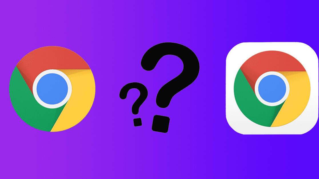
That’s right, pals, gone is this old, boring, and played out logo:
In its place, we’ve been blessed with this gorgeous, totally different, and completely unrecognizable new icon in Big Sur:
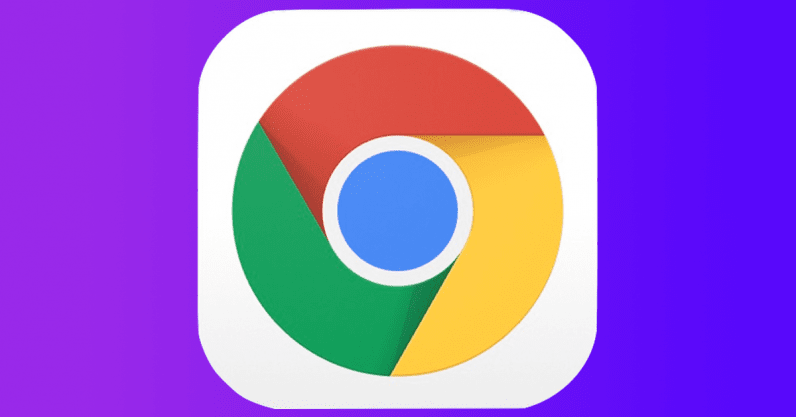
If you weren’t great at Spot The Difference as a younger, let me help you out: Google slammed a box around the old Chrome icon in order to make the new Chrome icon. 2020 really is the best.
That’s not all though, so don’t click away just yet.
Elvin Hu, a designer and developer at Google, shared this with us:
As many of you noticed, we introduced a new Chrome icon for macOS Big Sur today ✨ The team has also been exploring some further macOS-aligned options (some examples here), and we’re interested in hearing what you think about them ? pic.twitter.com/dUS70OZdCr
— Elvin ?️? (@elvin_not_11) November 17, 2020
To give a little context, the first design (A) is what the logo currently looks like. The B and C options are potential changes in the future.
Personally, C is my favorite of the three neumorphic designs. A is a bit too flat for my liking, while the exaggerated shadows on B makes it look like plasticine. This means C should be the new logo in Big Sur.
I will not be accepting questions at this time.
Google has been going through a bit of a logo redesign phase over the past couple of months. The biggest of these, as I’m sure you’ve noticed, has been the rebranding of G-Suite.
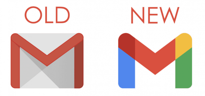
The company rid itself of the old designs in easily recognizable colors, and instead made everything in the same language. For example, here’s what happened to Gmail:
And this approach was echoed across the entirety of G-Suite:

My problem with this design is that, to this day, I struggle to immediately recognize the exact service I want to use on my phone or browser.
Thankfully, the new Chrome icon in Big Sur looks, well, like Chrome. I’m not sure what I’d do otherwise (complain a bit and then forget about it most likely), but it’s comforting for my tiny brain to not have to go through so much change.
Cheers, Google, for retaining the fundamental design language with the new Chrome logo. It’s about all I have left.
Get the TNW newsletter
Get the most important tech news in your inbox each week.
