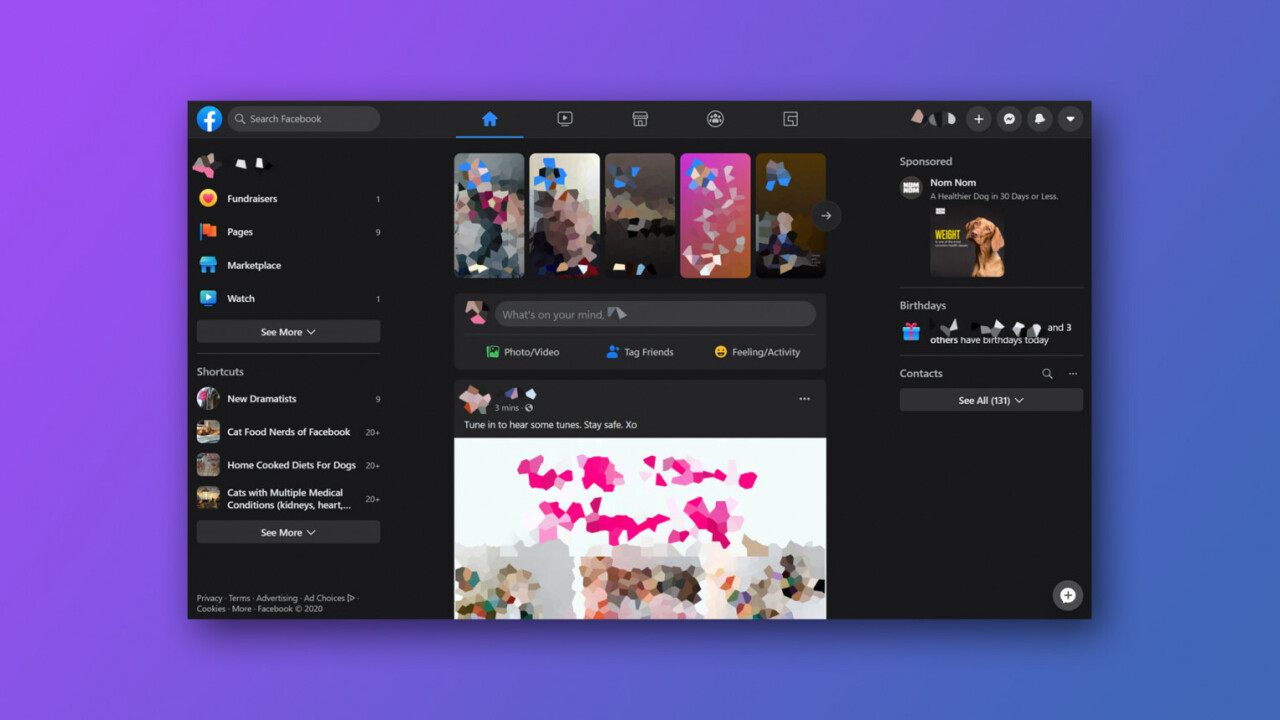
Facebook has been teasing a new design for its desktop website since last year’s F8, but so far, only a select few users have been able to access it. That’s now changing: Facebook told TechCrunch that “starting today, the majority of people will have access to the new desktop design.” This includes a nifty new dark mode too.
That said, the feature isn’t simply being forced on users yet. TechCrunch says at the moment the feature is opt-in; you can access it by going to Facebook.com’s settings menu and tapping “see new Facebook.” At the moment you can still revert to the old Facebook if you don’t like it, so it’s not a permanent switch.
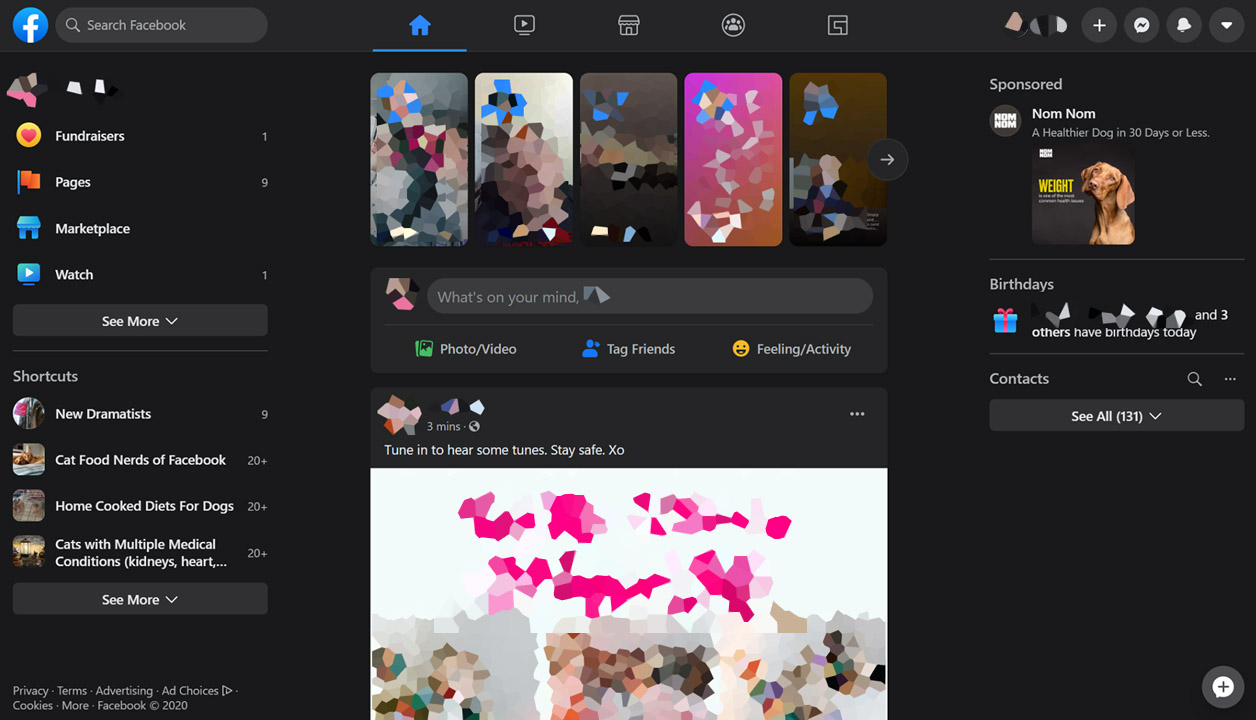
While I’m not seeing the option for the new design yet, several people I know do. As a recap, here’s what it looks like in dark mode:
And in boring old light mode:
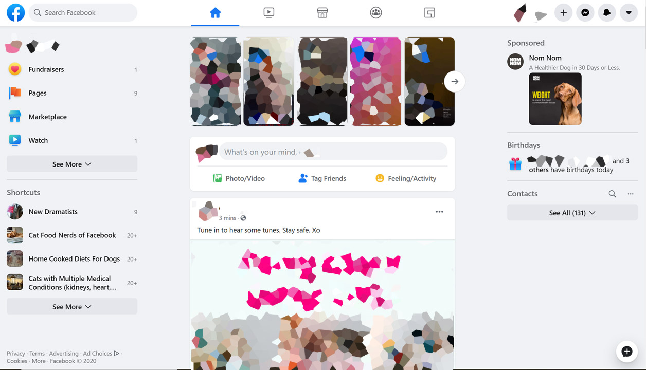
As you can tell, it’s quite a bit closer to the mobile app and Messenger designs; it’s a much more unified aesthetic. There’s less visual clutter overall and navigation is a bit more streamlined. According to TechCrunch, the home page and transitions load more quickly too.
It’s Facebook’s biggest redesign in years. Cue the inevitable complains once Facebook makes the change permanent.
Get the TNW newsletter
Get the most important tech news in your inbox each week.

