
Our sense of vision is the strongest pathway to deliver a memorable experience. As such, whether you’re a web or UX designer, you must master visual storytelling if you want to connect emotionally with users.
While you should certainly research what other sites, both in and outside of your industry, are doing, your story is your own to craft and tell.
The singular goal is to create visuals that work together and convey your message clearly and delightfully to your users.
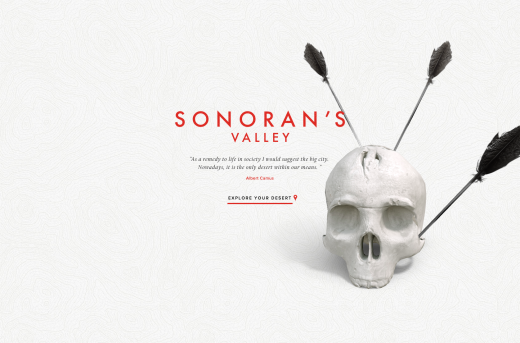
Consider illustrations as an alternative to photos
You don’t have to create custom images to create emotional impact with photos.
Granted, photos captured specifically for a site, and edited specifically to tell your story will always have an even greater impact, but of course can also stretch your budget beyond what’s possible (think about locations, photographer fees, and even travel or talent costs).
Even though you’ll generally need to create illustrations specifically for your project, they can still end up being more affordable than a full photo shoot. And stock illustrations are certainly available, although they’re often too generic to effectively tell a story.
Illustrations are appropriate when realism isn’t necessarily the top priority and when a diagram, flowchart, or similar graphic is needed to effectively tell your story. It’s pretty difficult, after all, to represent data or abstract concepts with a photograph.
As is the case with everything in web design, make sure you thoroughly understand your users. While illustrations are appropriate for almost every site, you must adapt the style to suit the appropriate look and feel.
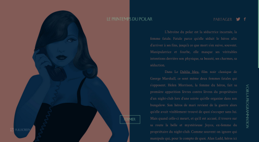
For example, let’s look at the images on the Le Printemps du Polar website, which feature a mature and alluring visual aesthetic that’s very appropriate for its artistic audience. The site celebrates the history of the femme fatale archetype in film, so we can assume that the people who appreciate the site are fairly sophisticated film aficionados.
Don’t fear the mascot
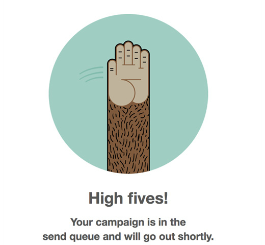
A site mascot is a simple but great way to tell a story, too. Mascots can say a lot about your brand since they are a living manifestation of your design persona. But don’t just create a single static version of your mascot. Instead, we recommend creating a dynamic version that feels alive in your interface (and provides fun conversational feedback).
Look at the MailChimp logo mascot, Freddie, for a great example. He’s a logo that says something. He implies movement, ambition, and determination. He tells a story all on his own, and is very adaptable at the same time. While a mascot may not be able to tell the entire story, it can enhance the other visuals on your site.
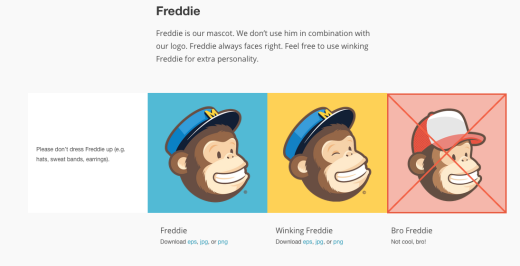
Mascots are more than just playful afterthoughts: they create emotional connections and emotions increase conversions.
Keep the background in the front of your mind
So far we’ve discussed the types of images you’ll use as part of your main content, but don’t overlook the importance of background visuals.
While you might think of them more as just an element to add interest rather than a powerful storytelling tool, they can certainly tell their own story or reinforce the story you’re already telling with other content.
Using background images that rotate or change depending on the purpose of the page adds an extra dimension of liveliness to your site. The more “alive” your site feels, the stronger the impression you leave – which means that users will remember your story.
If your story is complex, then video or motion graphics may be a more effective tactic than static graphics alone. Just keep in mind that with video, especially, a certain segment of your users is likely going to skip watching it, or at least wish that there was a text alternative. You may also run into issues in which it is impractical for your user to watch a video (such as when they’re pressed for time).
You must keep in mind, however, that the web experience is fast becoming a cinematic experience as high-resolution Retina displays become more popular and affordable. HD video in websites creates a rich multimedia experience with layers of information conveyed through a moving background.
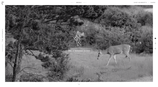
For example, even the golf company Ashworth uses a video background with a purpose.
Here are five ways to make background HD video work in your design framework:
- Pay attention to video length and duration – A background video should tell a visual story that users can get a feel for in a few seconds. It’s perfectly fine for the background to loop; it is more important that the video is sharp, clear and understandable. Somewhere between 10 and 30 seconds is a good goal for loop time.
- Turn the sound off – Sound is still a polarizing autoplay element for most users.If you’re going to play sound, allow users to turn it on (and make sure it’s not obnoxiously loud or annoying).
- Focus on load times – While HD video is fun, it should not bog down your website. If users abandon your site during a slow load, they will never see your awesome background. Never forget that usability is your first and foremost design consideration.
- Consider alternatives for devices or device connections that can’t render HD video – Check in Google Analytics to reveal popular devices, then design accordingly. Usually, you’ll find that you’ll want to use a static image as a backup option.
- Stick to quality video – Whether you film your own, hire someone to do it or use stock video, it needs to be top-notch in terms of visual quality. Not only does it have to work in a high-definition framework, but it has to actually be HD quality. Just like a photo, video falls apart at any resolution above what was originally captured.
Images must make reflect your users
We’ve touched on this a bit already, but it’s vital that the images you use in your storytelling make sense within the context of the story you are trying to tell, and the goals of your site.
- Does the image reflect your persona? – If your site is aimed at 20-somethings who work hard and play harder, don’t fill it with images of middle-aged people going about daily life.
- Do the colors in the image echo your brand? – If your site is all muted neutrals and you opt for images filled with neon colors, it could be very jarring for your users. To learn more, refer to the emotions of color explained in Web Design for the Human Eye.
- The same goes for style – A sophisticated site needs sophisticated images, a fun site needs fun images, etc.
- Make a list (even just mentally) of some descriptors for your site – Make sure that images you select also match those descriptors.
Let’s take a look at House of Borel below, a luxury boutique fashion brand, as an excellent example of telling the right story to their audience.
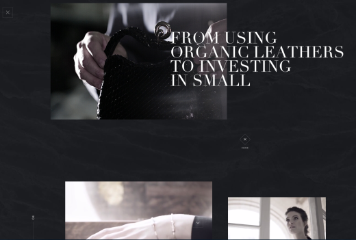
Each section of the site is labelled a “secret”, adding to the mystery our main character must unravel. As you explore each secret, you watch the character discover (in an almost Cinderella-like fashion) the remnants of handcrafted luxury. At each step, the site teases you to explore a little bit further – just like the on-screen character.
The brand understands it’s speaking to highly sophisticated young women, which is reflected in the main character. The generous negative space explained in Web Design Trends 2015 and 2016 also creates an immediate level of sophistication. The background music, while set to autoplay, provides just the right vocal ambiance without annoying users.
As a result, the unorthodox site experience tells the perfect story: we’re high-end, we certainly aren’t like other big-box brands, and we’re just the hidden gem you’ve been searching for.
Personalize the narrative
When you choose images to tell your story, it can pay off to focus on what sets your brand apart from your competition. This will make your story more personal, and help your users identify and connect with your site over others.
- If it fits in your budget, create completely custom images – Custom illustrations are less expensive than custom photos in many cases, but even photos shot specifically to tell your story are automatically going to be more personal than any stock photo you’ll find.
- List descriptors of your site that don’t apply to your competitors – Following a process of competitive heuristic reviews, play to your competitive advantages and emphasize them.
- Show people – People automatically identify with other people. Think about how many online retailers include photos of people wearing or using their products. Jakob Nielsen found in a study that social approval motivates people to purchase. The technique is effective for engagement even if you aren’t selling anything.
- Use colors and patterns in your images consistent with your visual design – Even adding something like a subtle color overlay to your visuals that tie them into your site’s overall color scheme can make a dramatic impact on the visual cohesion of the entire site.
The ultimate goal is ensuring your site meets the criteria of visual consistency: meet the user’s expectations based on their prior experience, ensure your site appears consistent on all pages, then throw in your own creative twist to stay memorable.
Conclusion
You can’t really design the UX of a site, but you can certainly design all the elements that contribute to the overall experience. Work backwards from your users, then narrow down your options based on what is most visually compelling.
As you’re creating the look and feel of your site, don’t forget to zoom out from time to time to check the overall visual consistency. It’s easy to get lost in the details, but make sure you come up for air periodically to evaluate your design from the user’s point of view.
For more advice on modern web design techniques, check out the free e-book Web Design Trends 2015 and 2016. You’ll learn best practices with analysis of 166 examples from companies like Google, Apple, Reebok, BMW, Intercom, Adidas, Dropbox and many more.
Get the TNW newsletter
Get the most important tech news in your inbox each week.