This year in digital design brought a wave of new techniques, styles, and trends, most of which emerged to meet the needs of the growing mobile browsing market.
Technological advancements changed user expectations of the aesthetics and functionality for sites and apps.

Source: Love Holiday
Of all the developments in interaction design this year, five stood out as the most substantial, and the most likely to carry over strong into next year.
Persuasive design
The heart of interaction design has always been the human-computer exchange, a conversation between the user and the site. But because almost every site has its own business objectives, it makes sense that the UI half of the conversation adopts some classic sales techniques.
This year saw the rise of more persuasive tactics ingrained into the design in subtle ways. These tactics are subtle and not as abrasive as the pushy salesmen we’ve all met, but they’re still effective enough to be integrated repeatedly.
Let’s take a look at some of the common tactics explained in the free guide Interaction Design Best Practices:
- Framing — How you present certain information is called framing. Instead of presenting a surcharge for credit cards as an extra fee, they might frame it as the normal price and say that paying with an alternative method earns a discount.

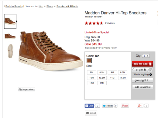
- Anchoring — Present a higher priced item first to suggest this price is standard, which makes every cheaper price seem like a deal. This is especially effective for with discounts, where users can see exactly how much they save.
- Loss Aversion — Studies show that customers respond more to avoiding pain than acquiring pleasure. Framing a offer like “if you don’t sign up, you lose $10” produces more results than “if you sign up, you save $10.”
- Scarcity — The lesser the quantity, the higher the perceived demand. You’ll notice sites like Groupon and Amazon continue to highlight scarcity to drive conversions.

Photo credit: Groupon
Invisible UIs
Good designs don’t draw attention to themselves. They work in the background so that users feel any success is due purely to their own abilities.
Here are some useful ways to empower the user in all interactions:
- Less and Simpler Steps — The less steps your user needs to complete their goals, the more successful your interface. Steps could be small, but even if you can remove a single click the user will appreciate it. Just look at how Uber (below) turns a multiple-step process of entering credit card information into a single, simple step.
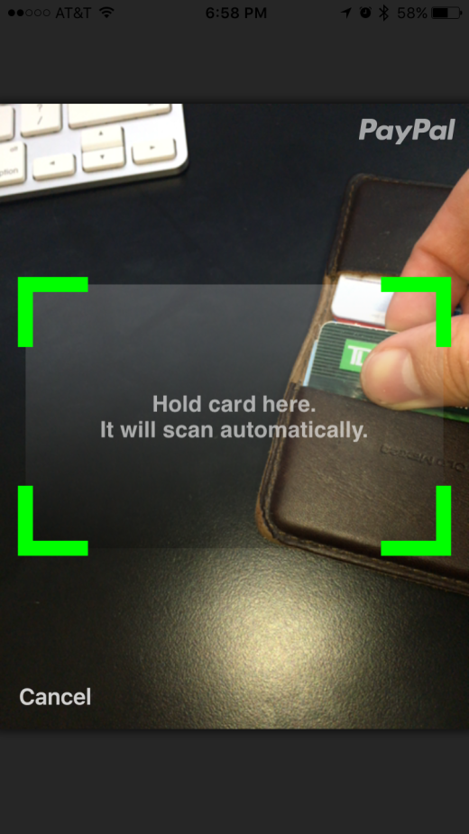
Photo credit: Drew Thomas
- Clear Visual Communication — Maintain a consistent visual theme and use universally understood signifiers (e.g. mail icon means messages or inbox) to reduce confusion and.
- Forgiving Interface — Anticipate common user errors and put the proper safeguards in play. These include options to undo, autosave, multiple-format inputs, and instructive feedback.
- Map User Flows — The best way to reveal redundancies and unnecessary steps is to graph out user flows visually. Jessica Downey explains her “tentacle map” for making a visual aid to organize the task steps, and their screens. Ryan Singer of Basecamp has a similar but faster shorthand approach.
Meaningful white space
As explained in Web UI Design Best Practices, empty space is not always boring space. White space, a.k.a. negative space, should be implemented just like visually active elements.
From an interaction design standpoint, think of white space as the pause between words in sentences. Without brief lulls to scan and process information, on-screen elements quickly lose their meaning.
Here’s some basic advice on white space that’s worth remembering:
- Negative space creates hierarchy — The more white space you place around an object, the more attention it will receive. This simple trick alone can help designers influence the visual hierarchy of what gets seen first.
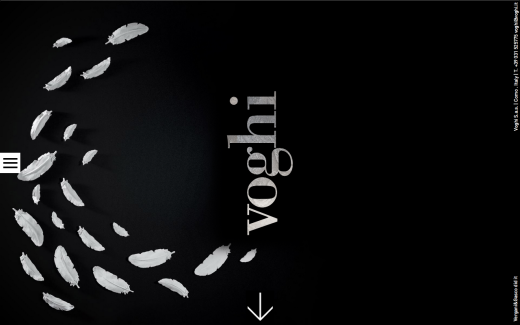
Source: voghi
- Minimalism adds sophistication — Minimizing the amount of elements and maximizing the amount of negative space gives your site an atmosphere of elegance and luxury. This is a tactic most commonly seen in fashion brand websites.
- Space affects legibility — White space isn’t just for background noise: when dropping down to the atomic level, spacing can improve or harm legibility. In this case, legibility refers to the ease of discerning letters in a word. Follow these guidelines for spacing between lines/letters to ensure legibility.
Interface copy as design
Extending the analogy of user interaction as a conversation, the designer of the interface must choose their words carefully. Everything on the screen of an app or site is considered the interface, so the text is certainly no exception.
If the meaning behind the words doesn’t match your site or app’s tone, not even the best typography will matter.
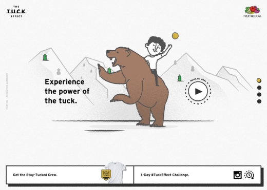
Source: Tuck Effect
It doesn’t help that copy comes in many shapes and sizes.
Typically, you can divide and alter copy by its category. Greeting copy might have a casual and welcoming tone, while on the same page a call-to-action text should have more bold and concise tone.
Regardless of the purpose of the text, the following guidelines can help you say what you mean:
- Know your audience — This is writing advice as old as time. Know your users and what they want to deliver the copy that speaks directly to them. For example, a site for children may repeat phrases and words to adjust for attention span, whereas a site for a law firm might do the exact opposite.
- Consider the context — Are you writing for a website or an app? A home page or an about page? Just like you would alter copy to suit the audience, do the same for the medium. If your app is designed for use in hectic or distracting situations (e.g. Waze when driving), punchier text makes the information faster to process.
- Display your personality — Your writing style will contribute to the overall mood and atmosphere of the site just as much as a strong image or fluid animations. Understand the emotions created by color so that your copy doesn’t clash with the visual interactions.
Delightful design
Last but not least, good interaction design is always enjoyable.
Forming an emotional connection with your user is the surest way to earn their loyalty. When it comes to design, the heart is just as powerful as the mind.
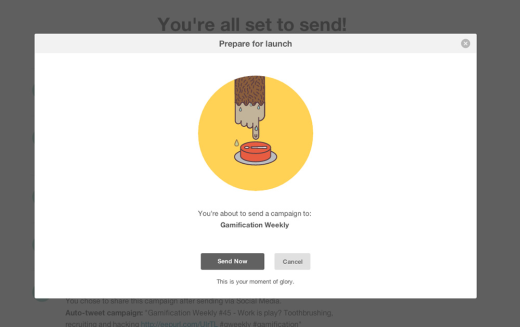
Source: MailChimp Launch
In the MailChimp example above, the confirmation window is an essential part of the email marketing user flow. Adding a fun graphic and some humorous copy adds some enjoyment at no cost (not to mention undercuts some of the tension of sending a mass email).
Here are some quick tips for delightful design:
- Don’t sacrifice usability — Think of delightful design as the icing on the cake: icing saves the cake from being bland, but icing alone is not a cake. Never strive or cleverness at the cost of clarity.
- Go beyond the surface — As designer Ben Rowe suggests, your ultimate goal is to create “meaningful delight”. Beyond the delightful aesthetics, how can your site or app lure people into a state of flow where actions feel unrestricted?
- Discoverables — Users love surprises. The appropriate microinteractions (like an animated fade-away as users complete tasks) make common tasks feel more emotionally rewarding. As shown in the below prototype, even a simple fade-in animation for a navigation adds more enjoyment to repetitive actions.

Source: UXPin
Read next: 5 secrets to awesome user design
Image credit: Shutterstock
Get the TNW newsletter
Get the most important tech news in your inbox each week.
