
Responsive Web design has become the preferred method for developing websites with a multi-device friendly approach. Recommend by Google and embraced by some of the largest sites on the Web today, quality responsive websites are equal parts development and design efforts.
In this article, we will look at 10 responsive design best practices for the careful designer.
-
Responsive Design: plan Small…and Big
One of the driving factors in the success of responsive web design has been the ability to create better experiences for users on mobile devices.
While the importance of this benefit cannot be overstated, the problem arises when designers think about responsive design as only a small screen solution. The truth is that responsive web design has benefits for all screen sizes, including very large displays.

Photo credit: UXPin
For the past few years, mobile traffic to websites has been climbing and today mobile visitors make up the largest percentage of traffic for many websites. While these statistics point to the importance of optimizing for mobile devices, this should not be done at the expense of larger desktop screens. There are still many people visiting websites with those larger screens (including many users who are jumping between devices at different times of their day) and the careful designer understands that improved support for small screens does not mean pulling back the attention they pay to very large ones.
When designing a web experience, you should take the “Mobile First” approach. Follow the advice in UX Design Trends 2015 & 2016: write down all the content categories, rank them in terms of priority, then lay them out in the smallest viewport first. Add elements as necessary when you move to larger viewports (like tablet or desktop). For example, if you’re using the collaborative design app UXPin, that means creating your first prototype on the 320px breakpoint.
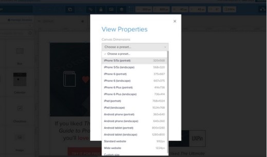
Consider larger screen sizes as well, and also the sizes between popular breakpoints. Remember that new devices are being introduced into the market every day (there are currently 24,093 distinct Android devices on the market), so the breakpoints that may be popular today may not be so in the near future, and sizes that are not even on our radar now may become critically important down the road. By focusing on both popular breakpoints and the gaps between them, you can design an experience with true scalability.
Scale your design up to even the largest possible sizes and make use of the expanded screen real estate that you have available to you.
-
Consider Context
Too often, responsive Web design becomes about little more than “fitting” a site onto different screens. A single column layout scales up to span multiple columns as the screen size grows, eventually ending at whatever the widest supported screen size will be.
The “fit-to-size” process makes sense from a purely layout scalability standpoint, but it ignores the actual content that is being presented in that layout (and it fails to consider context).
Think about a website for a restaurant. Obviously you want that site’s layout to fit well on a mobile screens. Context, however, goes beyond just that requirement to consider what content may be most relevant for visitors using those devices.
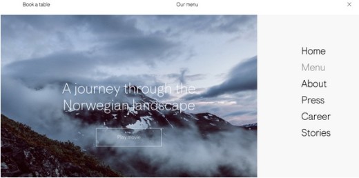
Photo credit: Maaemo
You may think that, since they are on a mobile device, these customers are looking for reviews or directions to the restaurant, but what if they are already at the restaurant? In that case, even though they are on a mobile device, they clearly do not need directions. Instead, they may be looking for something like nutritional information for that restaurant’s menu. The more data you have available to you (device, location, past visits to the site, etc.), the more context is available to inform your UX decisions.
As you work on a design, speak with the project’s development team to learn what data you can gather during a visitor’s site experience and how that information can ultimately better establish context.
-
Practice Thoughtful Reduction
In his book, “The Laws of Simplicity”, designer John Maeda introduces the concept of “thoughtful reduction.” He says:
“When in doubt, just remove. But be careful of what you remove.”
The statement may sound extremely aggressive, but an important aspect of that aforementioned “Mobile First” approach is to focus on only the content or features most important to people and to eliminate anything that is extraneous.
Going through this process for mobile will hopefully then carry over into the larger screen layouts as you accept that those features that you removed really aren’t necessary in those instances either. Getting to this point requires that aggressive approach to deleting elements from the page. The successful designer must learn how to be merciless in this regard while still being strategic about what stays and what goes.

Photo credit: Spotify Rewind
If you look back to Maeda’s quote, he says “when in doubt, just remove.” This is because it is often clear which elements must be included in a design.
- If you have to think about it and establish an argument for why you may need to include something for some edge case, then it is a great candidate for the discard pile.
- Keep what is important, question what remains, and be merciless in your decisions to trim the fat from your responsive designs.
-
Prioritize Content Differently
Moving from multiple columns for larger screen displays to a single column layout for very small screens is a typical trait of responsive sites, but layout changes do not stop with columns. Different content on your site will require different layout approaches.
Take something like article teasers, for instance. You may present that content one way for certain screens, but different screen sizes may necessitate a change in that presentation to be most effective. An example of this can be seen on the blog pages for the accounting firm, KLR.
At large sizes, each article teaser is presented with the following information:
- Editorial image
- photo of the author
- The title of the piece
- The author’s name
- The date of publication

Photo credit: KLR
But when this same page is viewed at smaller sizes, this layout changes a bit, with the editorial image eliminated to save space. Those images, while nice to have, are certainly not critical to the presentation of the content, so as space becomes tighter, it can safely be removed without taking away from the content as a whole. This is a perfect example of the same content being laid out and prioritized differently for various instances.

Photo credit: KLR
-
Scalable Navigation
Navigation is one of the most challenging aspects of a responsive website to design effectively, especially when you are dealing with very large, deep menus.
What works perfectly well for larger screens will break down completely on other devices. This is why, when designing a site’s nav, you are not looking for a consistent navigation experience across every different screen site or major layout versions of your responsive site. Instead, you are focusing on creating clear, user friendly navigation every step of the way – even if the exact way that navigation is accessed differs from one screen to another.
Now, saying that you do not need to be consistent in your navigation’s design across different devices may sound like a major UX faux pas, so allow me to clarify this comment:
- You should be as consistent as possible in your navigation, including the labels used on buttons and links and the visual characteristics of those buttons (font choice, color, etc.).
- Where you should break away from an insistence on consistency is in how the navigation works or lays out. A fly-out menu that is accessed via hover with a mouse may work perfectly fine for desktop visitors, but it will fall apart on touch screens and at small sizes. For those instances, the navigation you design should have a similar feel, but a different functionality appropriate to where it will be used (e.g. a navigation drawer).
-
Image Quality Versus Download Speed
The average web page rings up at a whopping 2.1 MB in size.
One of the biggest culprits in size is images. As website design trends move toward gigantic, screen spanning images (explained in Web Design Trends 2015 & 2016), the file size of pages will only grow.

Photo credit: 99 Properties of Power via awwwards
As designers, we want these images to look their best, especially when they are the primary visual that greet users. As important as that quality is, you must work to find a balance between rich visuals and overall page performance.
- When designing a responsive Web page, consider each of the page’s visuals and, once again, be aggressive in removing any that are not necessary.
- Reconsider elements like homepage carousels, which require multiple large images as well as the Javascript necessary to “animate” those billboard displays. By simply removing a carousel with 4 images and going to 1 static image, you can significantly reduce the size of that page by eliminating 75 percent of the images plus the animation scripts.
After you have aggressively cut away any images that are not needed, optimize any images that remain for Web delivery and use the appropriate image formats, including SVG files when possible. That is a perfect segue into our next point…
-
Use Icons Where Appropriate
Used correctly, icons can improve a responsive web design in a number of ways. Well designed, appropriate iconography help replace lengthy bursts of text, which is especially helpful on smaller screens where space is at a premium.

Photo credit: Peanutize Me via awwwards
- Icons can often be delivered to a website using the SVG file format. These Scalable Vector Graphics are a perfect fit for multi-device friendly sites since they can be resized as needed without adding to the file size of the images themselves.
- SVGs files can also be animated with CSS, adding some interesting effects to a design without bogging it down with lots of extra scripts that will have a negative impact on site performance. Fall back support will be required for browsers that do not support SVG, but for those that do, the use of this file format can have a number of benefits.
-
Pay Attention to Font Sizes
Typography is an important part of web design – responsive or not. But when designing responsive sites, you must take special care that your type design choices change along with other aspects of your layout.
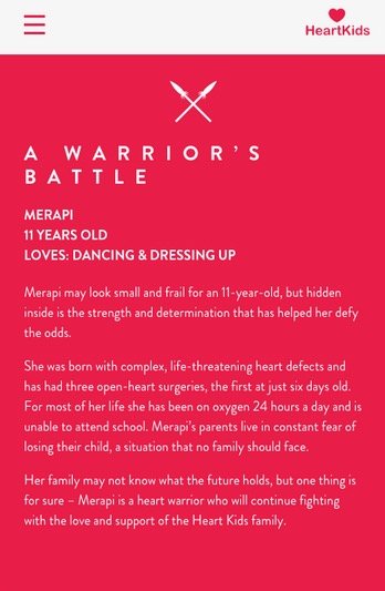
Photo credit: Heart Kids
When choosing a typeface, be sure that your selection works well and maintains the overall feel you want whether you scale it larger or smaller.
- Some typefaces with thin letterforms may work fine at larger or even medium sizes, but those letterforms lack clarity when they are sized down too small. This will affect the site’s readability, which is never acceptable.
- If you must use a particular typeface with thin letters, make sure that it is readable even at its smallest size or consider substituting a different font for those smallest sizes.
- The wider a column of text is, the more line-height (vertical height of each line of text) is required to help users find the start of the next line.
- 16pt body type is both the default on most browsers and a good place to start for all screen sizes. But it’s not the end-all requirement.
- Make headings clearly headings, at least 1.6 times as large as the text they support.
- Include adequate contrast on all your site’s copy, including the text versus the background color it is set against and the color of links versus the rest of the site’s content.
-
Think About Input Methods
Different devices means different input methods.
Desktop users are likely using a mouse and a keyboard to navigate your site and enter information. This is a very different experience from someone who is using a touch screen device to input all of their information with their fingers.
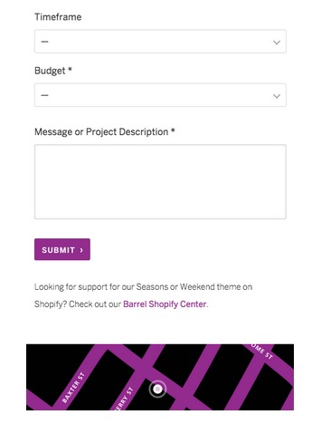
Photo credit: Barrel
When it comes to user input, (buttons, forms to be filled out, etc.), mErr on the side of “fat finger design” by being generous with the size of buttons and clickable areas.
- For smartphone viewports, size buttons at roughly 44 points square as recommended by Apple’s iOS Human Guidelines
- Test your design with at least five users on the actual devices that will be used to access it.
-
Test Your Design on Actual Devices
Planning how your design will scale for different sizes is an important part of designing for those devices, but you cannot stop at that theoretical approach.
Being able to interact with your design on real devices will show you how it really works, either confirming the decisions you made or showing you where improvements may need to be made.

Source: “Prioritizing Devices: Testing and Responsive Web Design.” Tom Maslen. Smashing Magazine (used with permission from editors).
In addition to your own testing, running usability tests with actual users is another important part of working with your designs in a real world setting.
First check existing analytics to see the percentage breakdown for users based on devices. Prioritize your tests based upon the breakpoint information. If you’re moderating the tests on-site, it’s also worth purchasing commonly used devices
If you can spare the resources, it’s worth testing different devices with different users. While this multiplies the number of users required for testing, it is the safest way to prevent bias due to design familiarity. For example, if you’ve designed three breakpoints, testing with 15 users (five per breakpoint) will help you uncover most usability issues. Services like UserTesting help scale usability testing affordably since they handle the recruitment, task creation, moderation, and analysis.
If you’re particularly tight on timing or money, you can test multiple breakpoints with the same users. Just randomize the order of devices presented to minimize the bias from design familiarity. For example, if you test mobile, tablet, desktop with User A, switch up the order for User B.
Additional Advice
If you found the advice useful, check out the free guide UX Design Trends 2015 & 2016.
Chapter two focuses on responsive and adaptive design by providing tips based on deconstructing some excellent examples of mobile-first design. The rest of the chapters break down the latest UX techniques based on 71 examples of great digital design.
Read Next: How to personalize your UX design without being creepy
Image credit: Shutterstock
Get the TNW newsletter
Get the most important tech news in your inbox each week.


